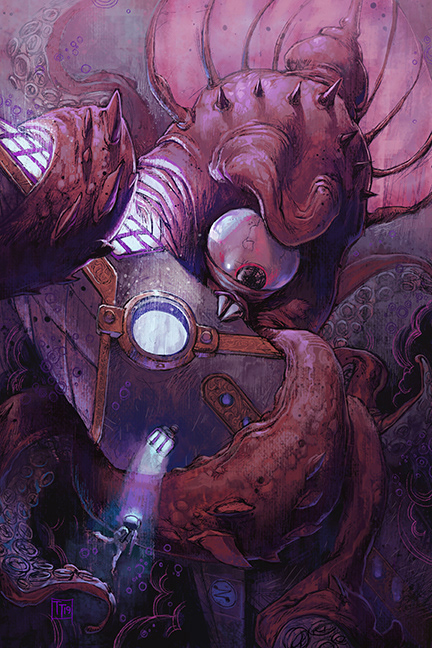
Leagues, 6"x 9", Photoshop
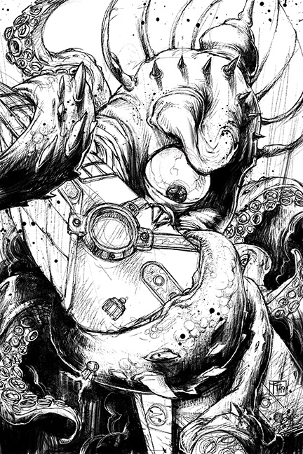
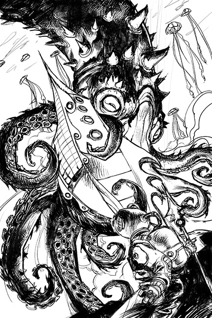
Leagues Drawing, 6"x 9", Photoshop
The Jules Verne story, 20000 Leagues Under the Sea is commonly illustrated with the scene of the Giant Squid attack. For the sake of tradition, I decided to do the same and maintain my stylistic aesthetics. I begin the illustration with a black and white "ink" drawing. I love working with a traditional painting approach, building layers while allowing textures and colors to show through them.
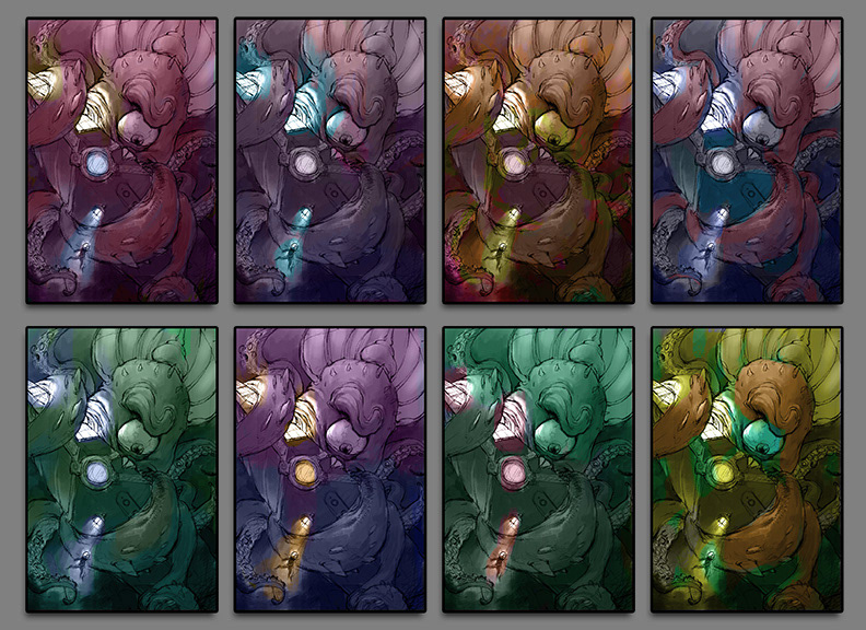
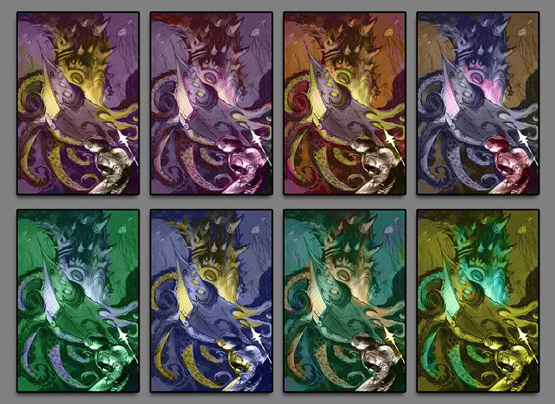
Leagues Color Comps, Photoshop
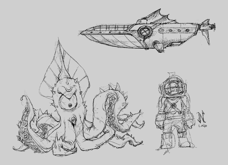
Leagues Concept Designs, Photoshop
Sketching the subjects of the illustration was fun to explore. I had a few goals in mind but I wanted to keep my style in tact. Dealing with the main subject, I decided on a goofy looking squid and veered away from the realism inspired design. The Nautilus is designed to have a look of a whale and Captain Nemo is stylized with a Chibi type of quality. I took a playful approach in the color comps. I was leaning toward a warm color scheme but decided on a cool lighting with a magenta red range as the warmest hue.
Leagues Drawing V.1, 6"x 9", Photoshop
Leagues Color Comps V.1, Photoshop
My first attempt at a final piece was too forced, having a strong influence from Mike Mignola. I love Mignola's work and designing the shadow shapes show clarity but I really felt that this wasn't me. No matter what I did, I couldn't keep the drawing from feeling like an amateur Hellboy cover. I scrapped it soon after doing the color comps.
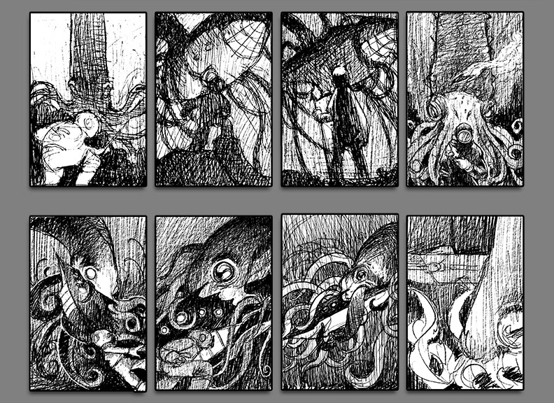
Leagues Thumbnails, Ballpoint Pen x Photoshop
I sketched many ideas just doodling in my sketchbook. After a few, I drew over and more iterations digitally. My main issue was keeping away from the center driven composition. The comps that drew me flowed from a top corner into a bottom corner, keeping aware of silhouette reads and utilizing the tentacles to move the eye.